
Insights
Welcome to our knowledge hub, where we share expert views on global B2B communications, industrial innovation and strategic marketing excellence.
Content is king, but only when credible
How to build brand reputability by prioritizing factual accuracy

The phrase ‘honesty is the best policy’ is not a new one, yet arguably it has never been more relevant. The modern era is often described as the age of misinformation, where everything from fake news to overexaggerated marketing campaigns has created a global aura of distrust, preventing people from truly understanding what is legitimate and what is not.
The Inside Track to the Latest K 2025 News

The theme of K 2025 is “The Power of Plastics! Green – Smart – Responsible.” With the plastics industry being hit hard with environmental issues, now more than ever, a pioneering spirit is needed to find solutions to address the current challenges of our era – especially in regards to solutions that support sustainable development and the circular economy.
6 key trends shaping the polymers and chemicals industry
.jpg)
Understanding what makes headlines is essential for effective B2B communications. Our 2024 Industry Trends Report examines media coverage patterns across the polymers and chemicals sector, analysing over 250 press releases and their resulting coverage in 10 key trade publications throughout the past year.
The changing face of beauty: four key trends shaping personal care in 2025

The global personal care market is expected to be worth more than 500-billion US dollars in 2025, encompassing everything from skincare and haircare to cosmetics and toiletries. As this dynamic industry evolves, we’ve been tracking four key trends likely to influence the industry over the next decade. One thing is clear – in today’s fast evolving market, brands will need to innovate to stay relevant.
Influencers: How does it work?
Understanding the Industrial Technology Influencer Niche
Influencers and thought leaders are a topic that sparks the interest of many B2B companies, but the question marketing communication professionals have is: how does it work?
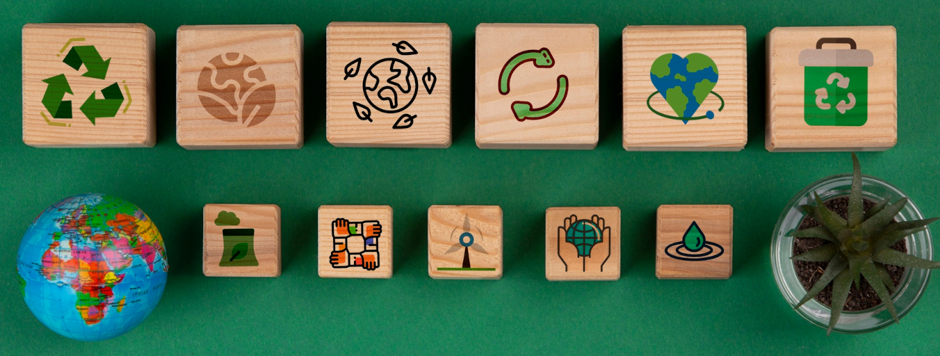
Climate and sustainability trends to watch in 2025

Halfway through what is often described as the ‘decade that counts’ for critical climate and biodiversity action, a report card would show strong progress in some areas of sustainability and less in others. 2025 brings two new wildcards into the mix – rapidly advancing AI and crypto technologies and a new US administration focused on rolling back existing environmental and social policies.
Textile industry trends 2025: a sector in transition

“Sustainability, Technology, Trade and Gen Z”. These are four words that describe what we believe are likely to be the biggest spheres of influence on the global textile industry in 2025. Many of our clients are at the centre of this highly sophisticated sector and we’ve woven together the trends to look out for in 2025 and beyond .

The top trends for marketing and communication professionals in 2025

2024 was a year full of major global twists and turns: 60+ national elections, generative AI, major changes to social media platforms, and cultural phenomena fuelled by TikTok trends – for marketers and communicators, keeping a handling on everything has been challenging to say the least. But what about 2025?
Embracing innovation: predictions for plastics 2025
The key trends in the plastics industry as we enter into 2025 all share a common link: transformation. The industry constantly evolves with new technologies and innovations that are helping reach sustainability goals and streamline manufacturing.
Top trends driving the automotive sector in 2025

Through our work with automotive innovators, we witness first-hand how rapidly this sector is evolving. From electrification and software integration to new mobility models, the industry faces unprecedented change.
Healthcare trends in 2025: medicine transformed

Dramatic advances in artificial intelligence and other advanced technologies mean that healthcare is about to experience its next major revolution. With a number of clients in the industry we’ve pulled together the trends likely to transform this sector in 2025.
Health, sustainability and technology: The top food ingredients trends for 2025

Today, more than ever before, consumers are scrutinising product labels and brands before making purchases. In the food and beverage industry, much of that scrutiny falls on ingredients labels, with an increasing number of consumers considering ingredient quality to be non-negotiable.
What automation trends will shape manufacturing in 2025?

We work with several companies in the manufacturing space, and a common story we encounter is how these companies are embracing technology to maintain a competitive advantage.
3 key trends influencing the chemicals sector in 2025
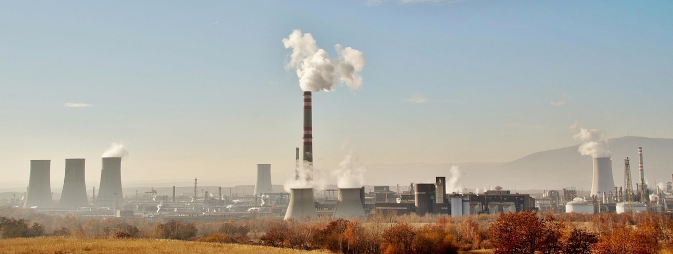
Change is happening fast. As we move through 2025, working with chemical industry leaders we experience these developments first-hand. We can see three interconnected trends and focus areas which are reshaping the landscape – building resilience, driving innovation, and embracing sustainability through green chemistry and circular economy principles.
5 key trends set to reshape the energy industry in 2025

With some experts saying that 2024 was the year in which global carbon emissions reached their peak, 2025 is now poised to be a pivotal year for the energy sector.
Unlocking the value of AI requires honoring human connections

Earlier this month, my EMG-colleague Adriana Pagels and I had the opportunity to deliver a keynote presentation at our client OQ’s Leadership Workshop. The main topic of the event was customer centricity and our presentation focused on the role of the media in telling customer centric stories.
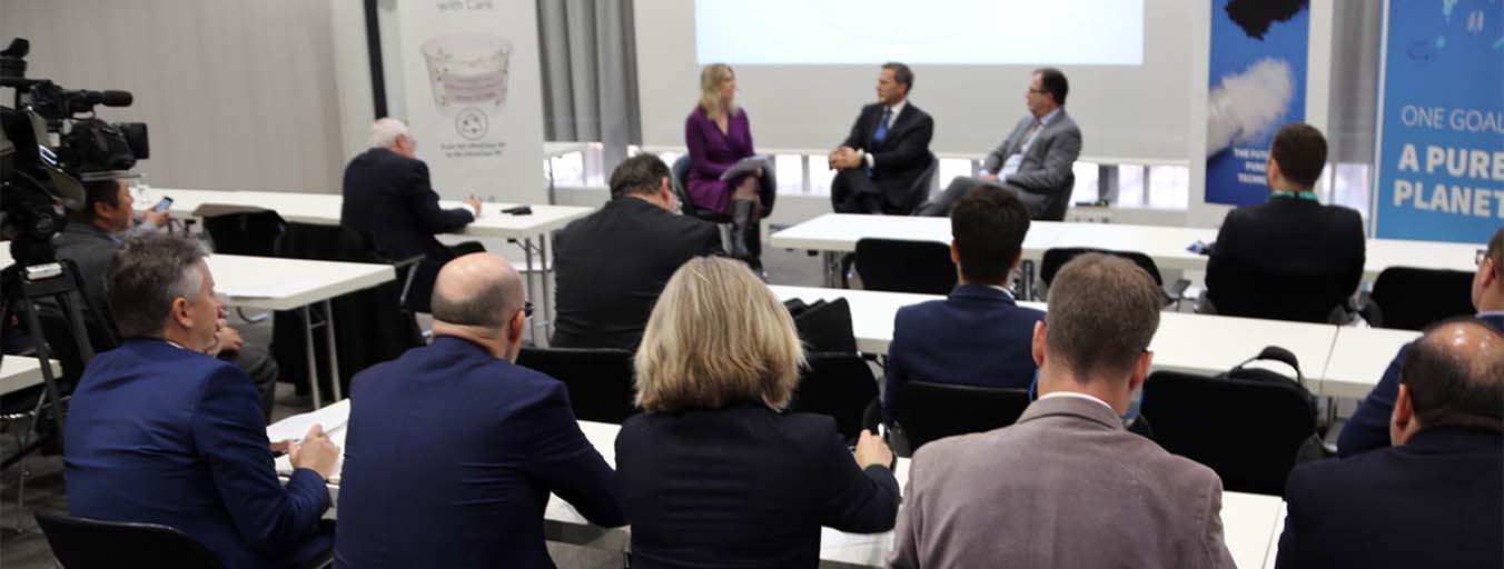
EMG helps customers score big on Düsseldorf show floor

K 2019 turned out to be a great event for our customers – but don’t take our word for it – listen to the positive feedback from our customers.
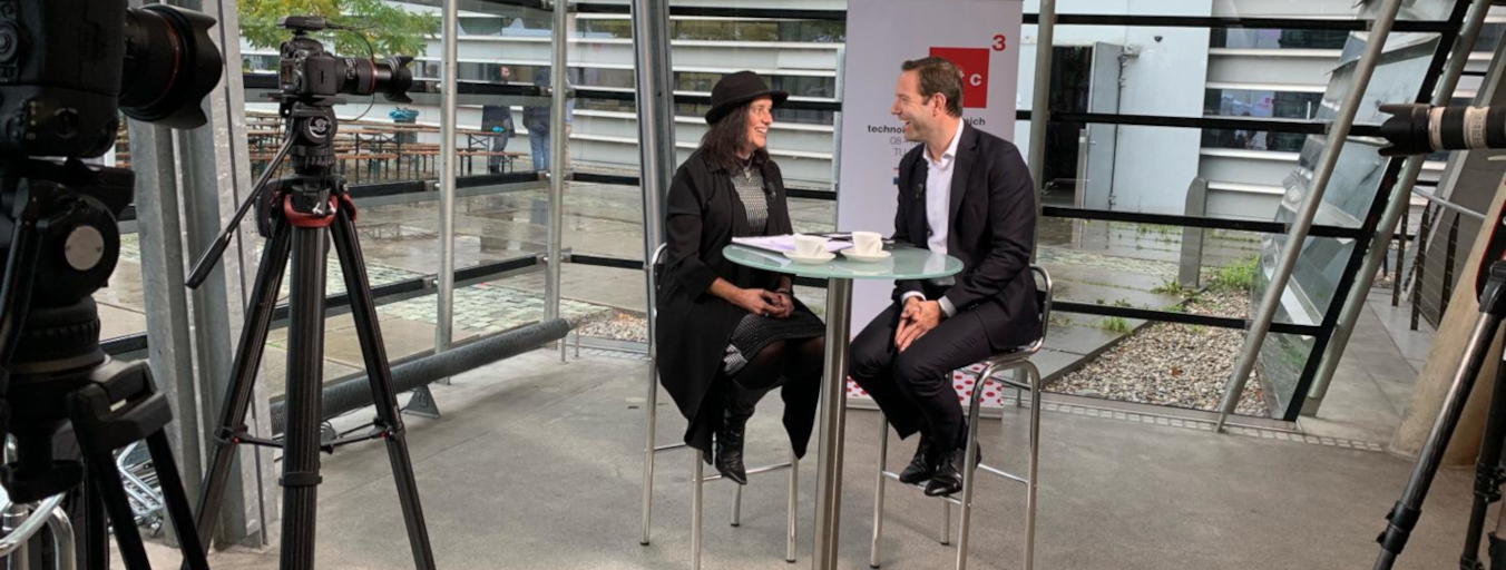
Q&A: style press conference scores at K 2019
A press conference featuring several of your executives is always a great draw for the international media, leading to real buzz in and around the event. But what do you do when you have an important announcement to make together with a partnering company?
EMG Training Programmes
Bringing out your inner spokesperson

In these days of 24-hour news cycles, fake news, alternative facts and focus on celebrity news, the soundbite is increasingly getting shorter, attention spans are waning and audiences are getting more cynical. Without doubt, it’s getting harder to be an effective spokesperson.
Activity by topic
Advertising
Content Marketing
Crisis Communication
Digital Marketing
Event Management
Global Industrial Communications
Insights, Strategy & Empowerment
Key Messaging Development
Media Relations
Research, Analysis & Reporting
Social media
Sustainability Communication
Thought Leadership & Executive Profiling
Training Programmes